The Select Breeders website is built using the WordPress Block Editor (sometimes called the “Gutenberg Editor”). It allows users to construct pages using Blocks. These blocks are grouped into sections:
- Text: Basic text constructs such as paragraphs, lists, etc.
- Media: Inserts images, videos or audio
- Design: Tools for constructing complex layouts
- Widgets: Self-contained “entities” which render specific datasets; includes custom blocks created for this site
- Theme: Renders content specific to this website.
This page will demonstrate several layout patterns as a guide for generating your own pages. Each layout is accompanied by an illustration describing the specific configuration of blocks.
General Notes
The Block Editor is similar to a word processing application. Most text can be styled with bold or italics by selecting it. Links to other pages are also possible. Text content can be aligned left, center or right.

Many Blocks will include this panel. For some block types it may be inside a tab called Styles. This panel can be used to set the text color and background color of the active block. It can also be used to set the size of the text. Note that by clicking the small settings icon directly above the XL option, you can switch to a slider control where you can discretely set the size of the text.
The Text and Background options will present a selection of colors chosen to create an overall theme for the site. The background color will fill the confines of that specific block, regardless of type.
Note that by default, only the Size option is visible. The three-dot menu in the top right (“Typography”) allows you to toggle on additional options:
- Appearance: the weight of the font
- Letter Spacing: adds space between letters
- Decoration: strikethrough or underline
- Letter Case: all caps, lowercase, or small caps
Note that Typography settings apply to the entire block. If you need to apply styling to individual characters, highlight the text and click the More arrow next to the link button.
Layout Blocks
Columns
The Columns block can have as many as 6 columns.
By default, Columns will stack on mobile devices.
Columns will stay within the confines of the page unless the Block is set to Full Width.
Row
Places Blocks horizontally in a row. Content will expand to fit content.
Note that the Row block does not wrap unless Allow to wrap to multiple lines is checked. If it is checked, Blocks will expand to fit their entire contents without wrapping (if possible).
Stack
Places Blocks vertically in a column.
Content will extend to the width of the page confines.
Spacer
Allows you to insert a resizable space between content Blocks.
Common Content Blocks
Images


Cover

A Cover Block accepts a background image, and can apply a colored overlay or visual effect to the selected image.
Multiple Blocks can be used inside a Cover Block; by default they will be stacked vertically, and will only have margin if the Block type specifies it (such as Paragraphs). Content will run to the outside of the Cover. By default, Cover Blocks are limited to the width of the page (not the window).

Cover Blocks can extend the entire width of the screen as well.
If you want to limit the width of the content inside the Cover, place a Stack inside. See Common Layout Patterns for more info.
Block Quote
A quotable quote can go here.
Pull Quote
A large pullquote can be used if you want to emphasize a comment from a specific person. My words will always create a new full-width region.
The person speaking
Details Blocks
Details Block
Heading Inside Block
The Details block can contain a single block. If you want to use more content, use one of the group blocks to compose your content. In this example we’ve used a Stack Block, which allows us to insert a Header and a Paragraph.
Another Details Block
Details Blocks can be stacked vertically; a border will be created between them.
Table
| Header 1 | Header 2 | header 3 |
|---|---|---|
| Column 1 | Column 2 | Column 3 |
| 1 | 2 | 3 |
| 1 | 2 | 3 |
Bulleted List
- Item 1
- Item 2
- Item 3
- Item 4
Numbered List
- Item 1
- Item 2
- Item 3
- Item 4
Common Layout Patterns
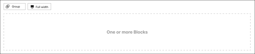
Full Width Block With Full Width Content
This pattern requires creating a Group Block, and then placing any number of blocks within. The Blocks will be stacked vertically with margins in between. The content inside this pattern will always fill the entire width of the screen.
The Full Width Block pattern allows you to create separately colored regions of content on a page. This region is light gray.
Diagram
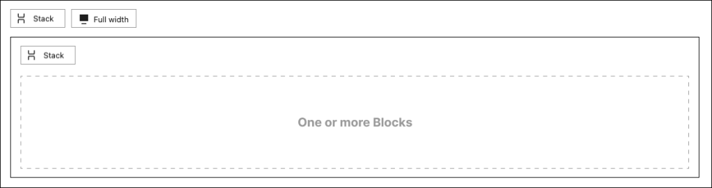
Full Width Block With Aligned Content
This pattern requires placing a nested Stack Block inside the outer full-width Stack Block. Content placed inside this pattern will be aligned horizontally within the group, expanding to the width of the content but not exceeding a fixed width within that block. This is useful if want to center a lengthy block of content while preserving readability. Use the Justification setting on the parent Stack to control the horizontal placement of the inner content.

When creating a group, this control will appear. It can be used to select the type of group. From left to right, the buttons will create:
- Group: one region for Blocks
- Row: aligns Blocks horizontally
- Stack: aligns Blocks vertically
- Grid: creates a grid of Block regions.
Grouped Blocks will have horizontal and/or vertical margin in between, depending upon the Group type.
Diagram
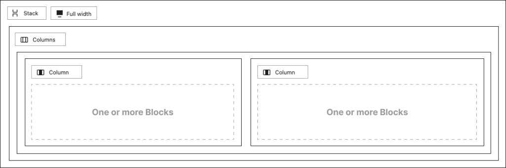
Full Width Block With Columns
With this pattern, content can be placed into two or more columns by inserting a Columns Block into a full width Stack Block.
Setting the Justification on the parent Stack Block to Stretch items will expand the width of the columns to fill the entire screen; otherwise, its width will be capped and it will be aligned based on the selected Justification value (left, center, or right). This specific example is set to center.
Any number of Blocks can be inserted into each Column.
Diagram